
Part 1 of this series explored the practical applications of using maths and statistics functions in Excel. This second part of the series will focus on forecasting and how to use moving averages, weighted averages, and exponential smoothing in Excel to derive deeper insights into data.
Moving Average
This takes the average over a period, e.g., seven days, and moves this through the data.
The result can be created with the formulae =AVERAGE (the function shown in part 1) or the Analysis ToolPak (also set up in part 1).
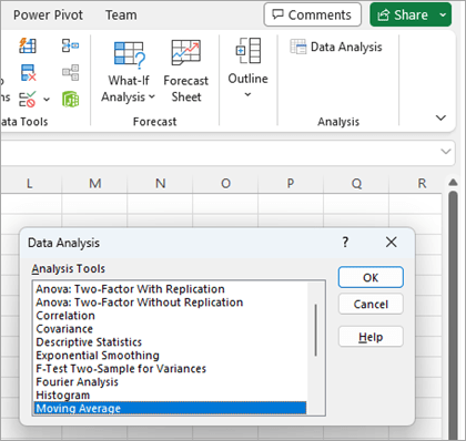
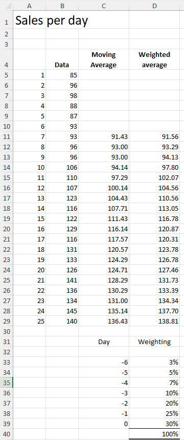
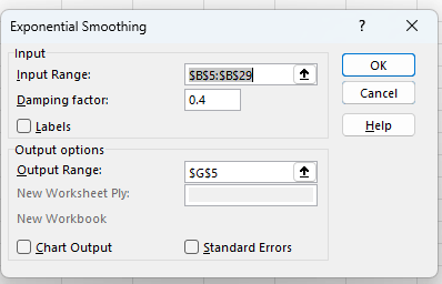
Once enabled the ToolPak can be accessed from the right-hand end of the Data Ribbon. You will see a new Group titled Analysis and within that an icon for Data Analysis. Press the icon and a new dialog box appears with a list of all the Analysis Tools that can be applied with this Add-in. Select Moving Average.
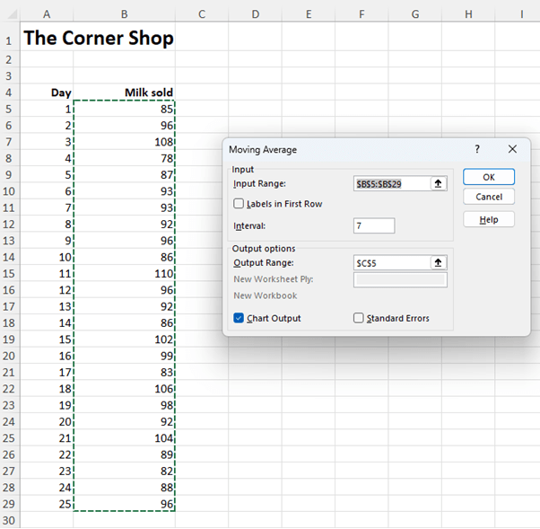
In the next dialog box enter the Input Range for all the values in the series. For this example, we are continuing with the milk sales data introduced in part 1. The Interval is the period of the moving average (in this case 7 days). The Output Range is where you want the results placed. All that is required is the top cell of the range in this case C5. At the bottom we have also placed a tick in the Chart Output option. When complete press OK and all the calculations and a chart will be created.
The results will look as follows:
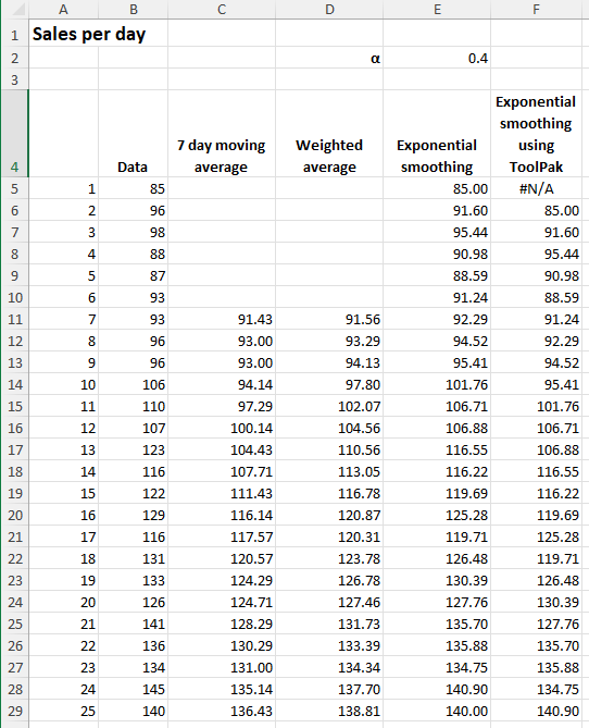
#N/A appears in boxes C5 to C10 as no calculation is done until there are seven values to use. Although the ToolPak has performed the moving average it has done so by populating cells with formulas. All the calculations are visible and editable. For example, in C11 the formula is =AVERAGE(B5:B11). As you progress down the column the range of seven cells moves through the data.
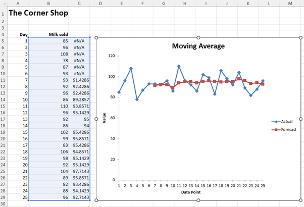
The chart drawn shows the actual values in blue and the seven-day moving average in red. All chart attributes are editable. What is clear on screen is the seven-day moving average is fairly horizontal and thus demand could be interpreted as flat. This is much easier to interpret that the more volatile underlying daily data.
Weighted Average
With a moving average each of the past values has equal weighting in the calculation. With a weighted average you can have some values having more impact than others. For example, if you wanted to place greater emphasis on more recent sales you might choose a weighting as follows:
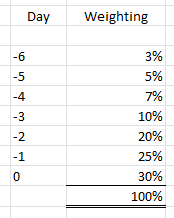
With a moving average each of the past values has equal weighting in the calculation. With a weighted average you can have some values having more impact than others. For example, if you wanted to place greater emphasis on more recent sales you might choose a weighting as follows:0 being the current day. -1 being the previous day. -2 being two days previous and so on.
The way to construct this to split 100% over the range of values you want averaged. In our example the most recent value has 30% of the calculation whereas the value from six days ago has a weighting of only 3%.
This type of analysis is particularly effective where there is rapid growth or decline exhibited in the data. Taking a moving average over such a profile will have a ‘lag’ effect and will under record growing data and over record declining data.
Using some new data for the example below we use the function =SUMPRODUCT(range, range) to multiply two ranges of data together and add up the result. Be careful with this function that both ranges must be of equal size for this to work.
For example, in cell D17 the formula is =SUMPRODUCT(B11:B17,$D$33:$D$39). Note the weighting range is an absolute reference so the formula can be dragged down the column and continue to refer to the same range of weighting values.
We have included a Moving Average (as shown above) to illustrate the lag effect that this calculation has on the rising data.
Exponential Smoothing
This third method of analysing data is an extension of a weighted average to bias newer values over older values.
The principle works on taking a factor α which is a value between 0 and 1. The formulae = current value * (1 – α) + last calculated value * α. Interestingly some commentators have the α as the multiplier for the current value and (1 – α) for the last calculated value. In this part of the series, I am using the method applied in the Excel ToolPak.
If α is 0 that will reproduce the entered data and as it increases to 1 more and more historic data is included. With α = 1 the results are all the first value.
In the example below we are using an α = 0.4 as shown in cell E2. This means that in each cell in column E it takes 0.4 * the current data value and 0.6 * the previous historic value.
For example, in cell E10 the formula is =($E$2*B10)+((1-$E$2)*E9).
This process can be done by using the Analysis ToolPak. As above select Data Analysis from the Data ribbon and the Exponential Smoothing option from the dialog box. The Input Range is as before. The Damping factor is the α value and the Output Range is the first cell in the column where you would like the results placed. As before a chart can also be generated.
A word of caution using this method is that it sets the first cell of the Output Range as #N/A and then develops the series of calculations. My preference is start in the same row as the current data and get a closer mapping of the smoothed data. This is a rare occasion when I think humans can do a better job than Excel!
Here is a table of all the results:
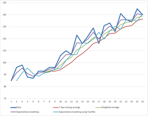
Shown below is a chart of all the methods together. The thicker blue line is the actual data. Exponential smoothing having the closest correlation to the actual data and the 7-day moving average demonstrating the ‘lag’ effect on rising data by being substantially below the actual data points.
You can see the manual Exponential smoothing compared the ToolPak version gives a much closer mapping of the lines.
In any analysis there is a need to build evidence from multiple sources and collectively these help identify trends and data insights.
In the next part of this series, we will explore Regression including how to use trend lines, identify the equations for trend lines and apply these to forecasting.
Archive and Knowledge Base
This archive of Excel Community content from the ION platform will allow you to read the content of the articles but the functionality on the pages is limited. The ION search box, tags and navigation buttons on the archived pages will not work. Pages will load more slowly than a live website. You may be able to follow links to other articles but if this does not work, please return to the archive search. You can also search our Knowledge Base for access to all articles, new and archived, organised by topic.